Mobile Punch It: portrait layout on Android and iPhone
The same nine stages and the same four figures, rearranged for a tall screen. The tracker holds the top, the arena takes the middle, and setting up moves to a panel under your thumbs.
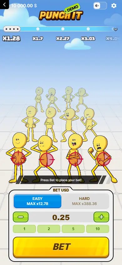
Portrait layout. The tracker holds the top of the screen, the figures fill the middle, and setting up happens at the bottom.
The game → On a phone
Can instant win games be played on a phone?
This one can, and it was clearly laid out with a phone in mind rather than shrunk to fit one. There is no separate application to install: the game runs in the browser or inside an operator's own app, and the account, the balance and the account tools stay wherever they already were.
That matters more for a game with this shape than for a spinning title. A round here is a sequence of deliberate taps, each one of which can end it, so the controls have to be unambiguous at thumb size. They are: the four targets, the glove and the withdraw control occupy three separate zones and never trade places.
What follows is the portrait layout in detail, because the arrangement is genuinely different from the desktop one even though nothing about the game is.
Portrait presentation on Android
On an Android phone the logo and the value tracker sit across the top, the receding rows of figures run through the centre, and the setup controls occupy the bottom. The arena uses the available height to show all nine rows as depth, with the four current figures as the largest characters on screen.
The difficulty halves appear in a wide two-part control with each ceiling written inside its own side, so the choice stays legible without a tooltip. Minus and plus flank the stake amount, quick values take a row of their own, and the start control spans most of the panel width.
The result is that configuring a round and playing one happen in different halves of the phone. Stable touch targets below, the field of figures above, and nothing that moves between the two.
The iPhone layout and the safe area
The iPhone presentation follows the same vertical order and keeps the navigation, sound and settings controls inside the upper safe area. The logo sits below them, and the tracker still comes before the figures, so the system furniture never covers a value label — which on a game whose labels are the specification would be a real defect.
The lower panel leaves margins around the device edges and uses large controls. Once a round is live, that panel gives way to the glove and the withdraw state. The change narrows the screen to the decision in front of you without moving the rows of figures, so nothing has to be reacquired mid-round.
Both platforms get the same nine positions, the same four figures and the same two settings. Nothing is withheld from either.
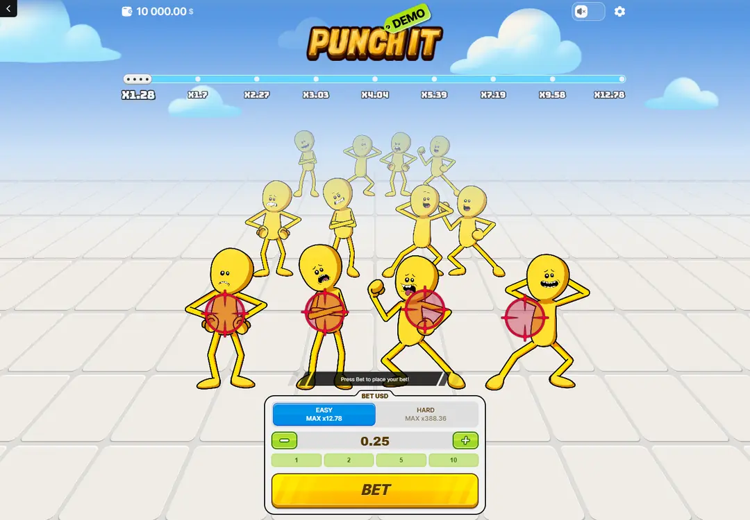
Easy mode. The nine values run along the top before anything is staked, and the four figures in front are the current stage.
Controls during a live stage on a small screen
The four front figures stay individually recognisable in portrait. Red overlays identify the live row, the glove takes a separate central zone below them, and the green withdraw control appears away from the glove after a success — which is the one piece of spacing that absolutely has to hold, because those two controls do opposite things.
The tracker records completed stages in green and keeps the upcoming values in order. On a narrow display the nearest values get the room and the far end of the path sits tighter, while the nine-position structure stays visible. Both ceilings remain readable in the selector before a round starts.
In practice the phone version makes rounds faster, which is worth knowing rather than celebrating. Each round is still a sequence of separate decisions, and they are easier to make quickly than they are to make well.
The same specification on every screen
Portrait play keeps both value paths, all nine stages, four figures per stage, manual selection, the glove, the withdraw control and access to the verification panel. The return figure and the x388.36 ceiling belong to the game, not to a device: a phone changes scale and control placement, not the round model.
Desktop leans on the width — the full nine-value path and the arena floor at once. Portrait leans on the height, with the depth of the rows doing the work the width used to. The bright sky, the yellow figures, the red glove and the green progress states are the same on both.
One figure does not travel with the layout, and it is the one worth checking on whichever device you are on: our source lists the return at 96% and one operator's own page for the same title is headed 95%. The information panel in the client you are signed in to is the version that applies to you.
Questions about playing on a phone
- Is a download needed?
- No. The game runs in a mobile browser or inside an operator's own app, with the account and balance staying where they already are.
- Do both settings work in portrait?
- Yes. The two halves of the difficulty control stay side by side with each ceiling written inside its own side, before a round begins.
- Does the tracker still show all nine positions?
- The structure stays, but a narrow screen gives the room to the current position and its neighbours and compresses the far end of the path.
- Does anything change about the round on a small screen?
- No. Nine stages, four figures, manual or automatic selection, and a withdraw control after every success. Only scale and control placement change.
The portrait states described here were recorded from the Android and iPhone layouts by the earlier build of this site. No figure on this page is taken from an outside page without being named as such.